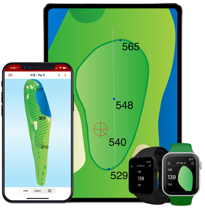
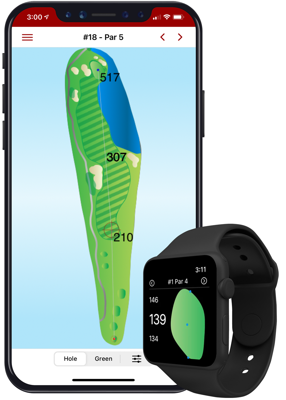
Golf GPS Usability – Variable Map Display
One Size Does NOT Fit All
When it comes to Usability related to Golf GPS devices and software, personalization is the key to an optimal experience. If you’re on a smaller hand-held device, you may need larger map images that fill up the entire width of your display, with the ability to scroll up and down. But, if you’re on an iPad or any other large screen device, scrolling up and down to view the maps would be a nuisance. It would be better to display the entire map within the single screen
Variable Size Map Displays
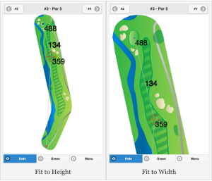
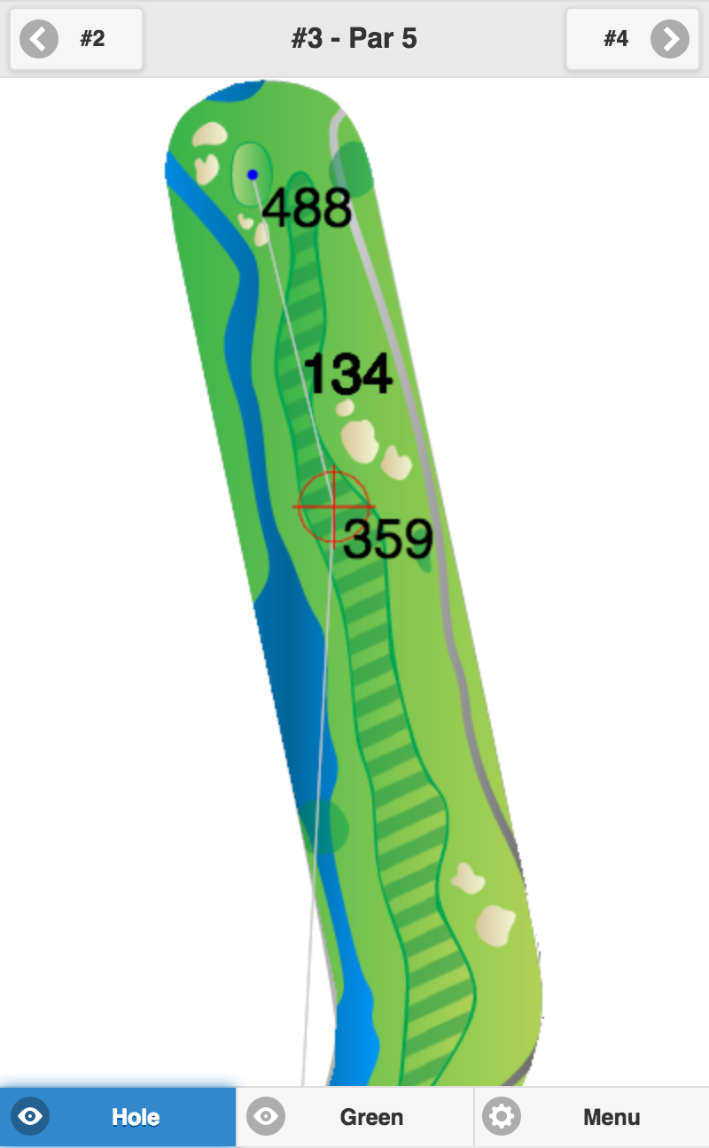
At Birdie Apps, we’re proud to be the first in the field to introduce Usability features to our Golf GPS App. Now, golfers can choose how to display the maps in the Golf GPS App to fit their needs i.e. make it more usable for them. Here’s an example of what this means. You choose the way to display maps based on your screen size and / or your viewing preferences:
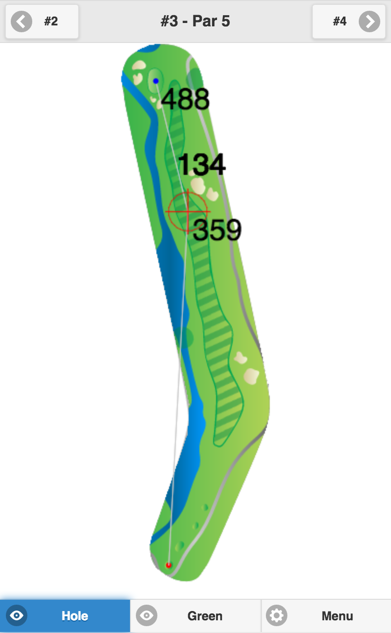
Fit to Height
Balanced Fit
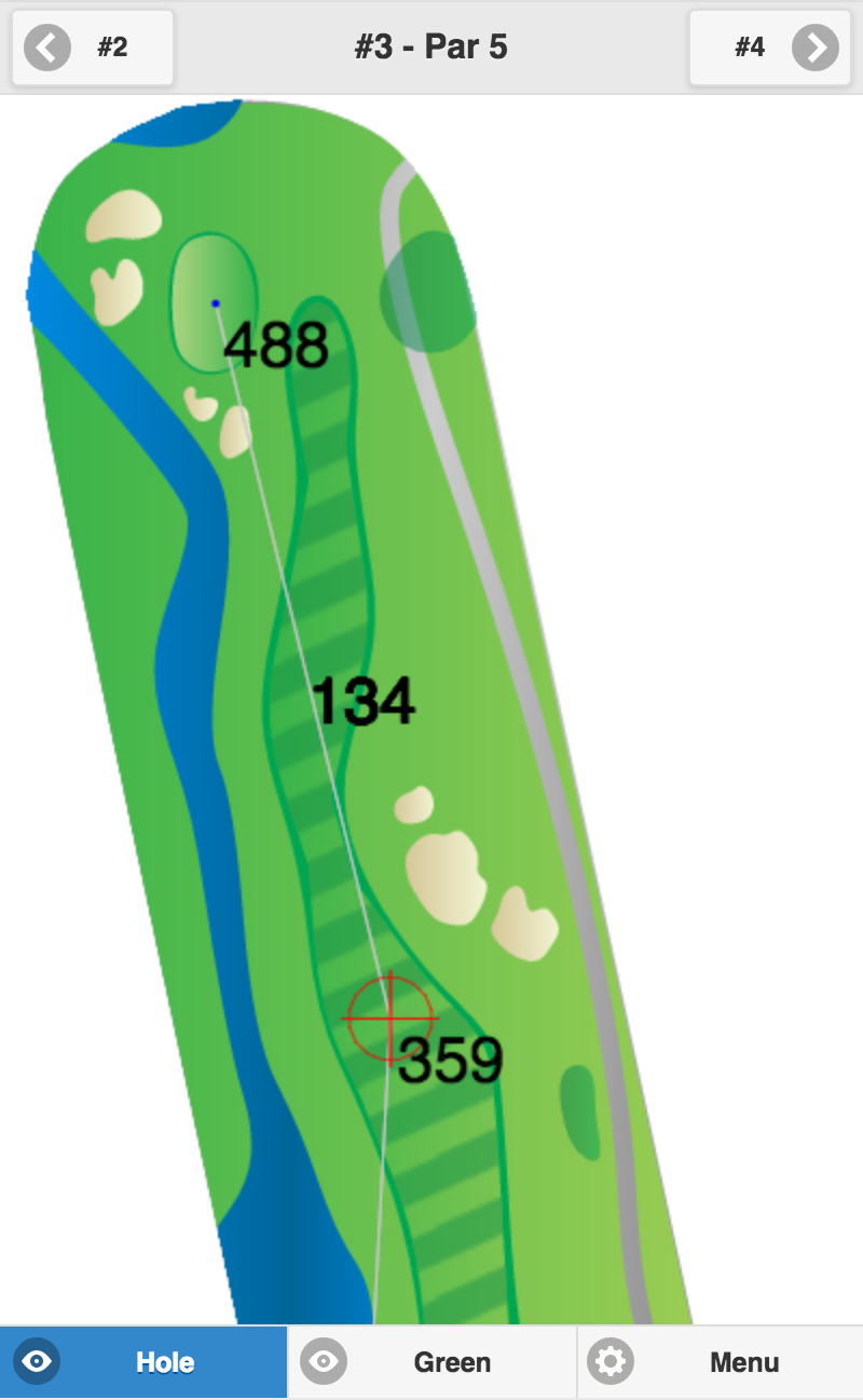
Fit to Width

